The Distaff Side
The Distaff Side was a series of craft-based workshops, through which we engaged with the anthology Bookmaking on the Distaff Side. Bookmaking on the Distaff Side was published in the USA in 1937 by a group called ”The Distaff Side” – women working in the printing industry.
Female bookbinders, printers, typographers, illustrators and writers (among them Gertrude Stein) contributed to the book with historical essays, satire, biographies, poems, manifestos and typographical experiments. The contributions are printed separately in different designs, on different paper stock, on different printers. The book is bound and published by Jumbo Press, a private press based in San Francisco and run by printer Jane Grabhorn. Jane also worked with her partner Robert Grabhorn on the Grabhorn Press, and later Colt Press. She kept the Jumbo Press active on the side, on which she printed children’s books and satirical reflections on the printing business.
“Ever since the days of Mrs. Gutenberg, women have been involved in the art of printing; and now, more than ever, they are to be found in the offices and factories concerned with the making of books. Yet never before have they been organized into a group for the express purpose of producing a book by, for, and concerning themselves. Bookmaking on the Distaff Side is the product of their writing, their designing, their type‐setting and their printing”
– from the preface of Bookmaking on the Distaff Side
From 2015 to 2017 we used Bookmaking on the Distaff Side as a dialogue partner and recipe book, researching its contributors and content and making a series of contemporary responses in collaboration with local artists and crafts people.
The Distaff Side is arranged as a series of episodes. Each episode engaged a different contribution in Bookmaking on the Distaff Side, drawing inspiration from the content, the craft method or both.
Episode I: Punctuation Pets – A Tribute to Ruth
Screenprinting workshop with Ciara Phillips at Konsthall C, Stockholm, December 2015
In this episode we engaged with the two page contribution by Ruth Douglas Keener.
Ruth Douglas Keener was a writer and poet. Her contribution to the book, Punctuation Pets, is a spread in which she has drawn animals in a humorous and playful way using punctuation symbols, and given them witty names that rhyme with the punctuation. One can imagine that part of her work has been correcting the use of punctuation in texts to be published, and that this spread brings to life the signs and her relationship to them, showing a lustful approach to text and typography.


Episode II: Are women the natural enemies of books?
Woodcut and lino cut with Ulla Wennberg, Stockholm, Winter 2015
This episode was based on the contribution Are women the natural enemies of books? by Anne Lyon Haight and the wood cut illustrations by Anne Leyneman.
In her contribution to the book, Anne Lyon Haight refers to a book in which Andrew Lang (Scottish poet, literary critic, etc.) wrote a chapter entitled "Women – The Natural Enemies of Books" in which he places women in the same category as moisture, dust, dirt, bookworms, careless readers, borrowers, book thieves, library looters, etc. Anne Lyon Haight addresses this in her article, partly by describing economic and social reasons why women did not always have access to fine books, partly by writing about historical women who were prominent book collectors.
The text is illustrated by woodcuts made by Anne Leyneman depicting drunk nuns rolling around with glasses of red wine in the convent library, eyes crossed as in cartoons. A satirical commentary on Lang's claim of women as the enemy of the book, commenting on the historiography that highlights the work of monks in copying and caring for books, and glosses over the equivalent work done by women.
Ulla Wennberg has her studio on Långholmen in Stockholm and has worked with graphics since the 60s, often with motifs and messages that touched women's everyday lives and struggles. She is involved in Xylon, which is an international association for graphic designers.
We spent a few days in Ulla’s studio where we experimented with wood, mdf and linoleum, and printed on different types of paper and fabric.
Episode III: A Typographic Discourse for The Distaff Side of Printing, a book by the ladies
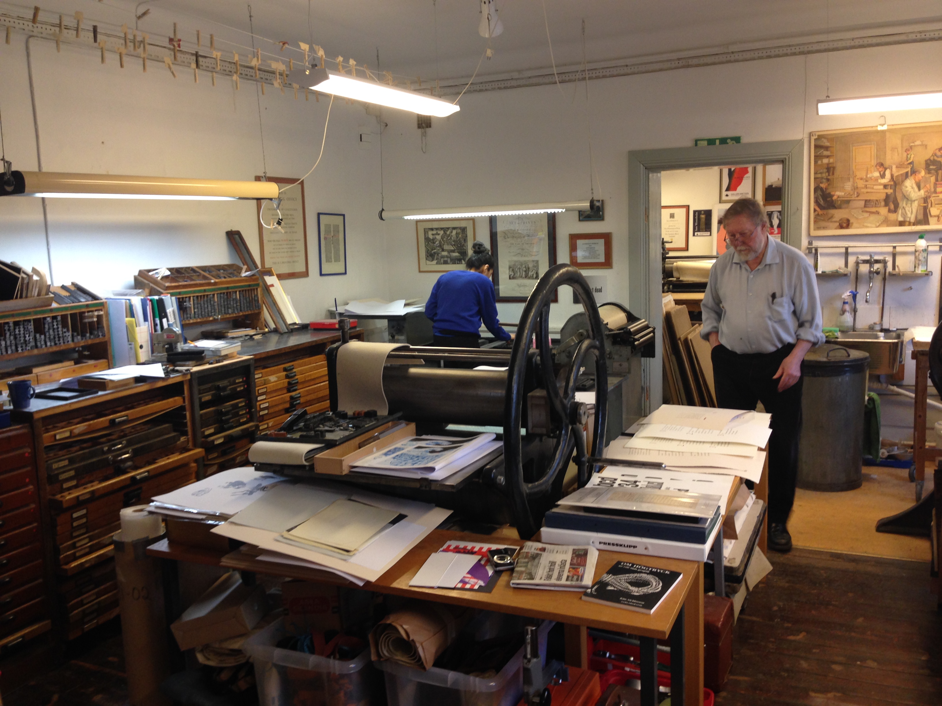
Letterpress printing at Kretsen in Södertälje under the supervision of Olof Sandahl, based on the text A Typographic Discourse by Jane Grabhorn. Winter 2017
Jane Grabhorn is the one who coordinated and published Bookmaking on the Distaff Side. Her text A Typographic Discourse for The Distaff Side of Printing can be read as a manifesto that does away with typographic rules and proposes a less orthodox approach to typography and letterpress. Here, Jane Grabhorn presents three principles. In short she suggests 1) don't hyphenate but let the letters freely fall down to the next line, 2) combine different fonts freely according to your taste, 3) don't correct mistakes but let them be part of the work.
We wanted to explore lead typesetting by hand by following Jane's principles. She concludes each principle with a few stanzas of poetry that summarize what she wants to say in a humorous and resourceful way. We chose to typeset one poem each in a different font, and combine them in one layout.
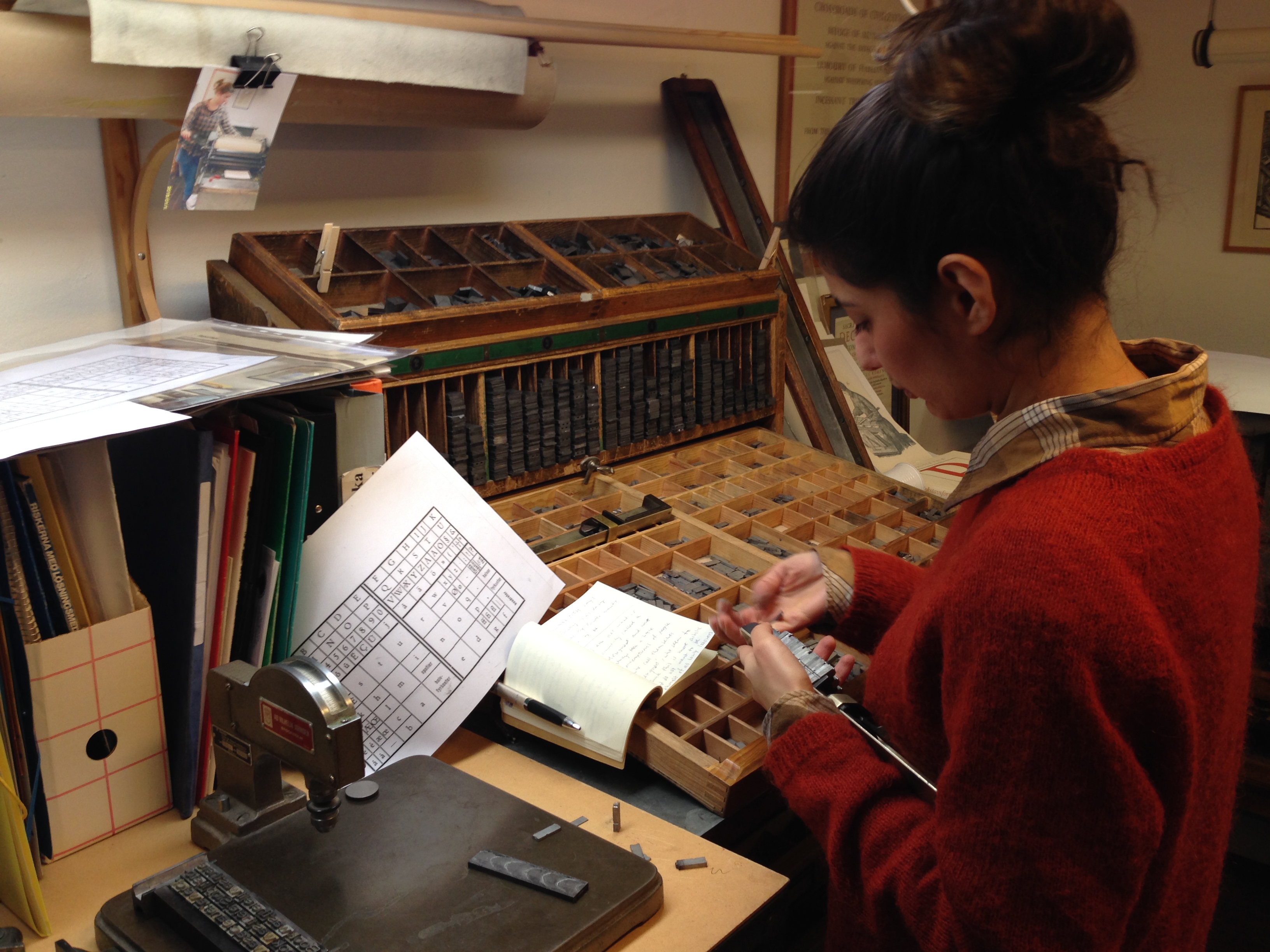
We came into contact with Olof Sandahl and Kretsen through Grafikens hus. Olof is a graphic designer and manager of the graphics workshop at Kretsen and has extensive experience in establishing graphic workshops such as the one at Grafikens hus and at Kungl. The Academy of Arts (both of which have unfortunately burned down). At Kretsen in Södertälje, he has created a fantastic letterpress workshop with tools, presses and typefaces from various closed workshops around the country.
Spending time in the workshop and typesetting heavy metal is a way to become familiar with the text as a physical material. We had read that Virginia Woolf, who was long known for writing long sentences with many subordinate clauses, completely changed her language and writing after she began to set her own texts - then the sentences became short instead, because they become easier to handle then, physically and technically. We had also read about the Women's Typographical Club, which was formed in 1902 by women who were not allowed to join the union, about the heavy work they carried out, and which was also claimed to be unsuitable for women, which is why they were paid less compared to male colleagues. When we worked in the workshop, doing heavy lifting and practicing the speed of our fingers, we were for a moment in the bodies of these women.
Episode IV: As long as printing prints words
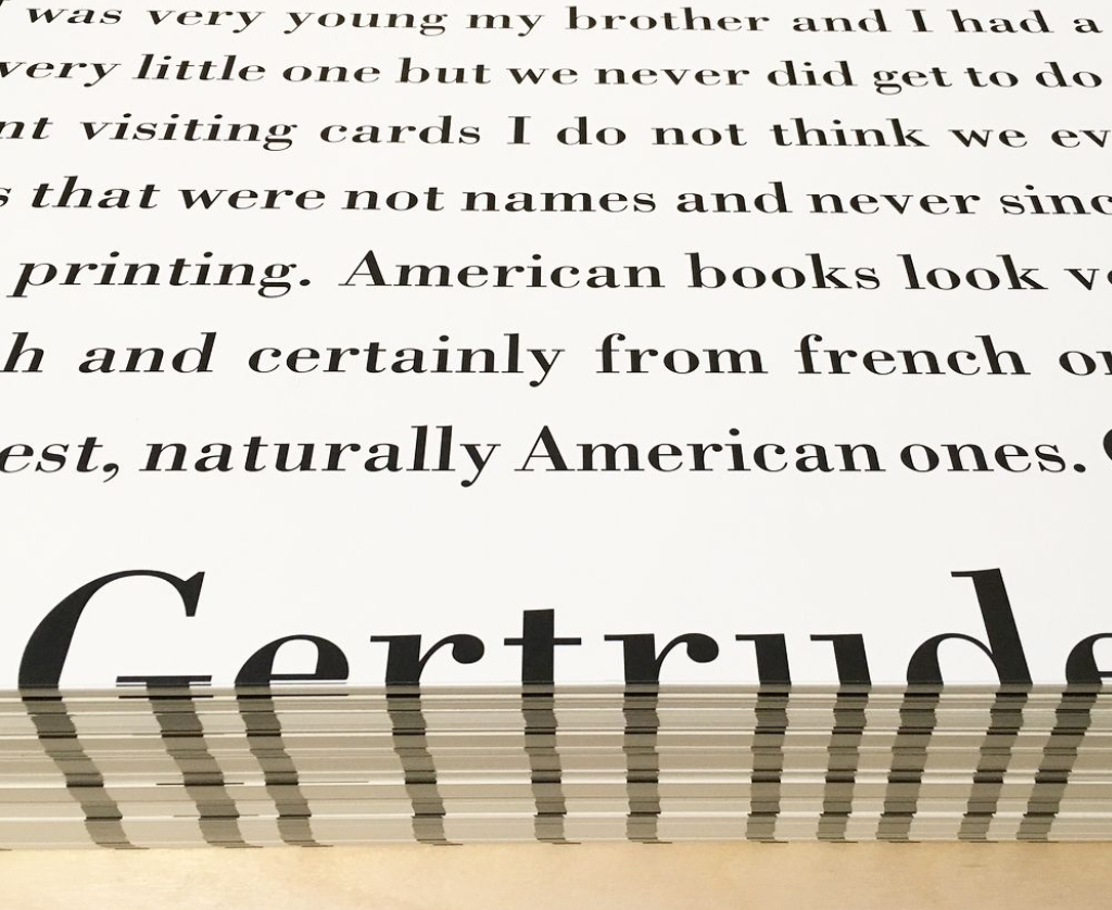
Offset printing, 2017
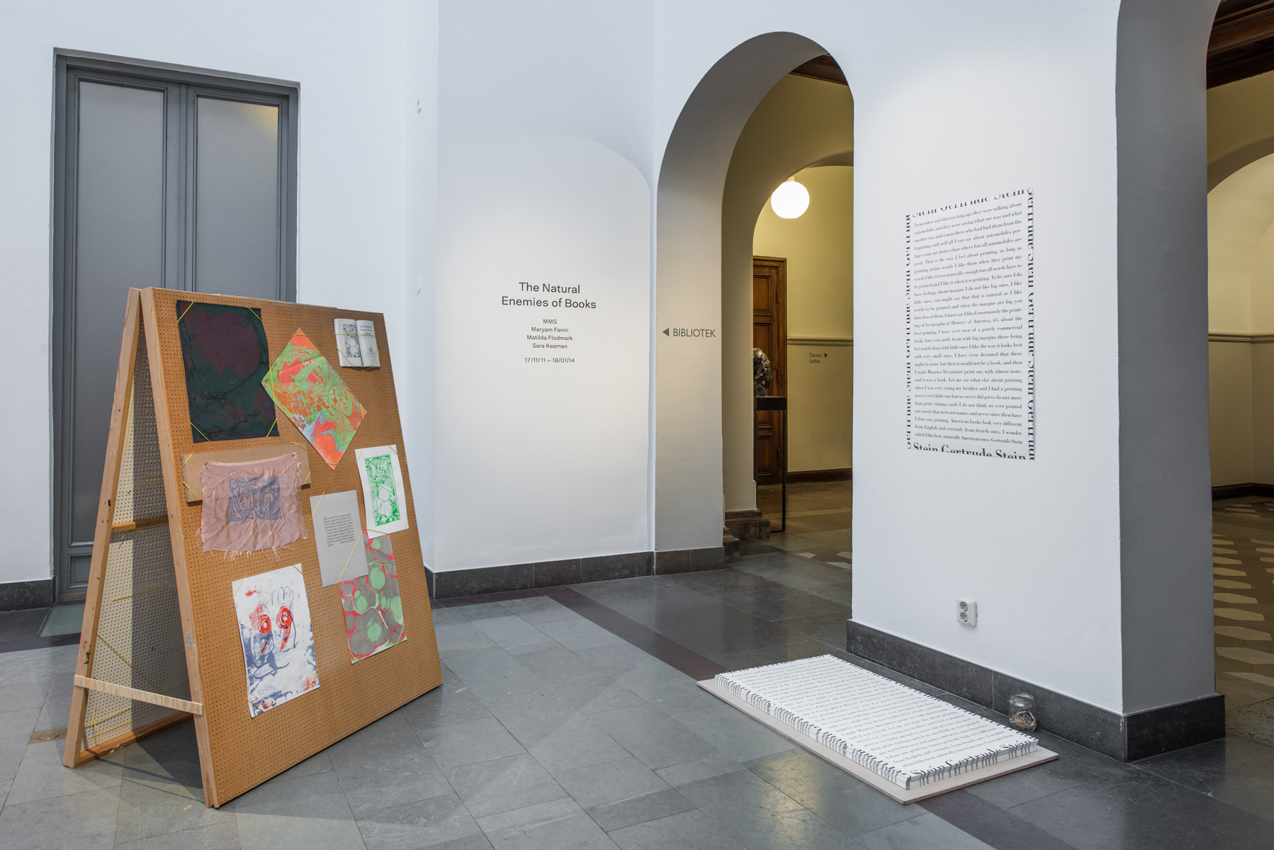
Gertrude Stein was one of the contributors to “Bookmaking on the Distaff Side” and perhaps the most well-known name among them. Her contribution is one page only, presenting a, typical for her, “stream-of-conciousness”-like reflection on typography, printing and margins. She writes “That is the way I feel about printing as long as printing prints words I like them when they print my words (...).” The text is framed by her name repeatedly placed in the margins spilling over the edges of the page. The typographer behind this elegant piece is Stein’s long-term collaborator and book designer Ernst Reichl. We made an offset facsimile of this contribution in large format as a give-away poster for our exhibition at Konstakademien.
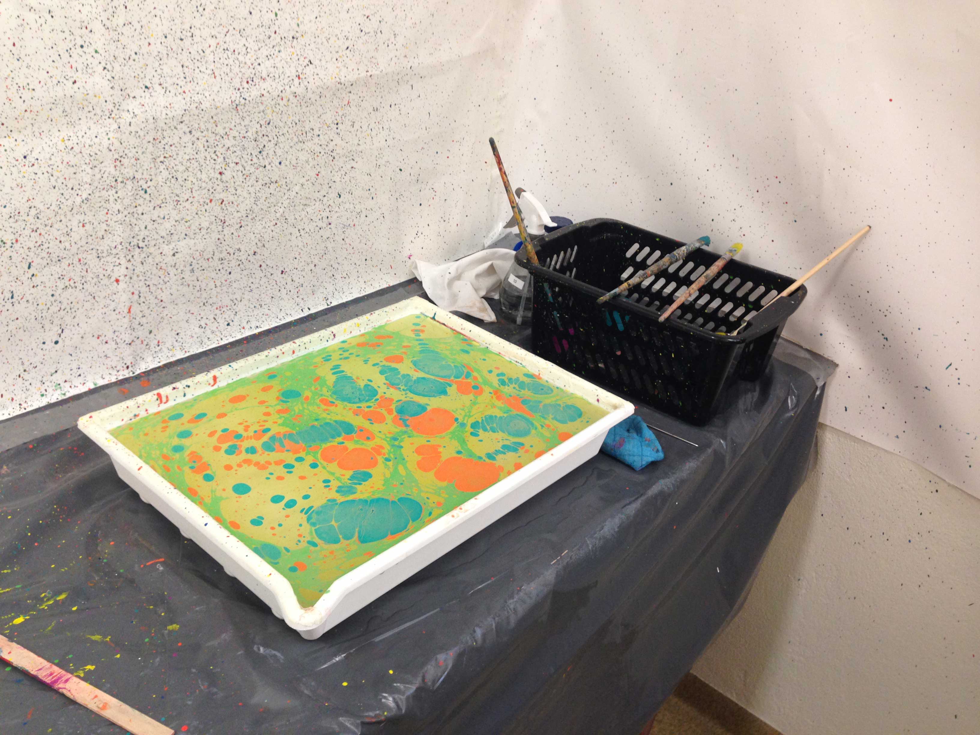
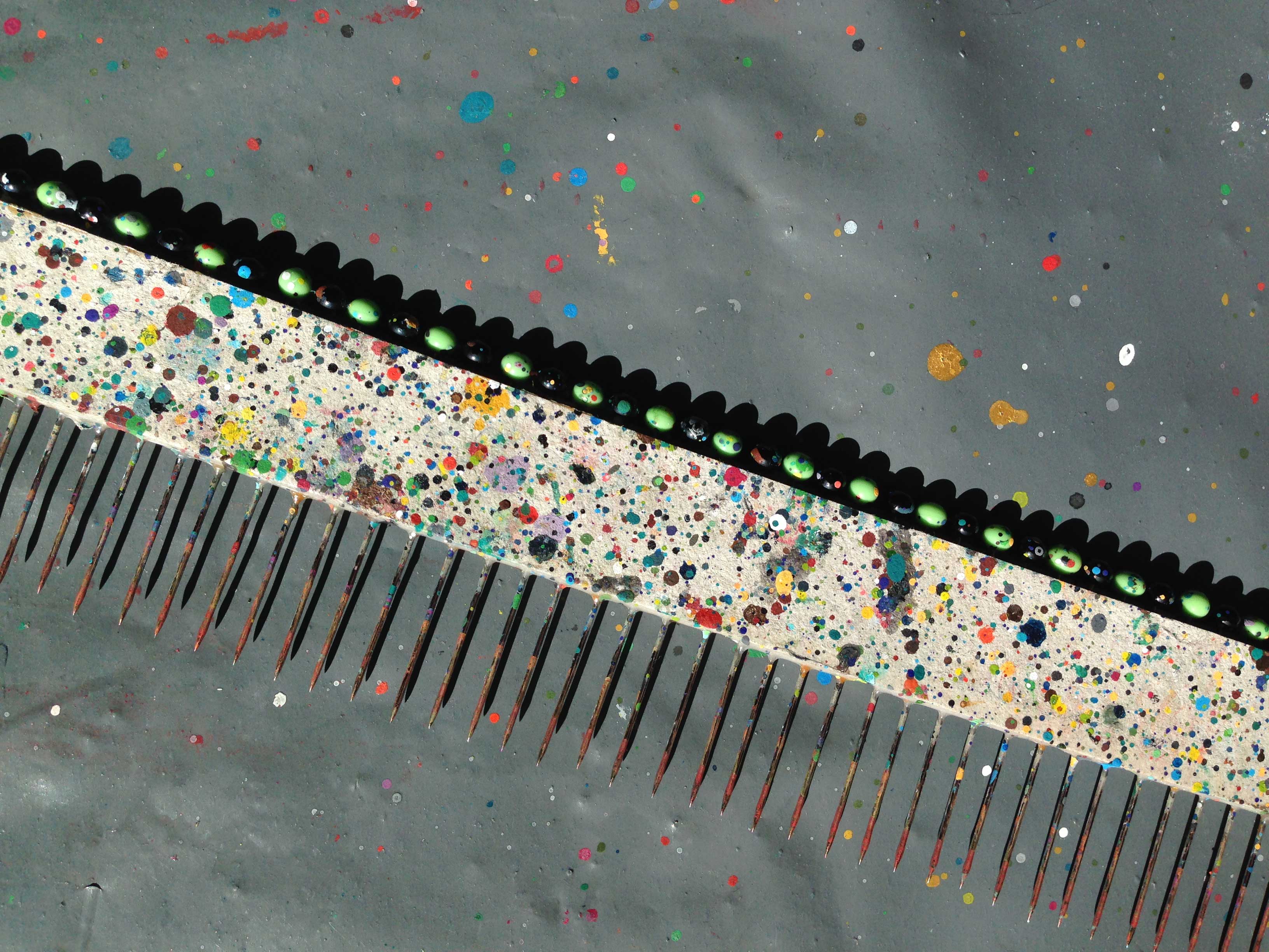
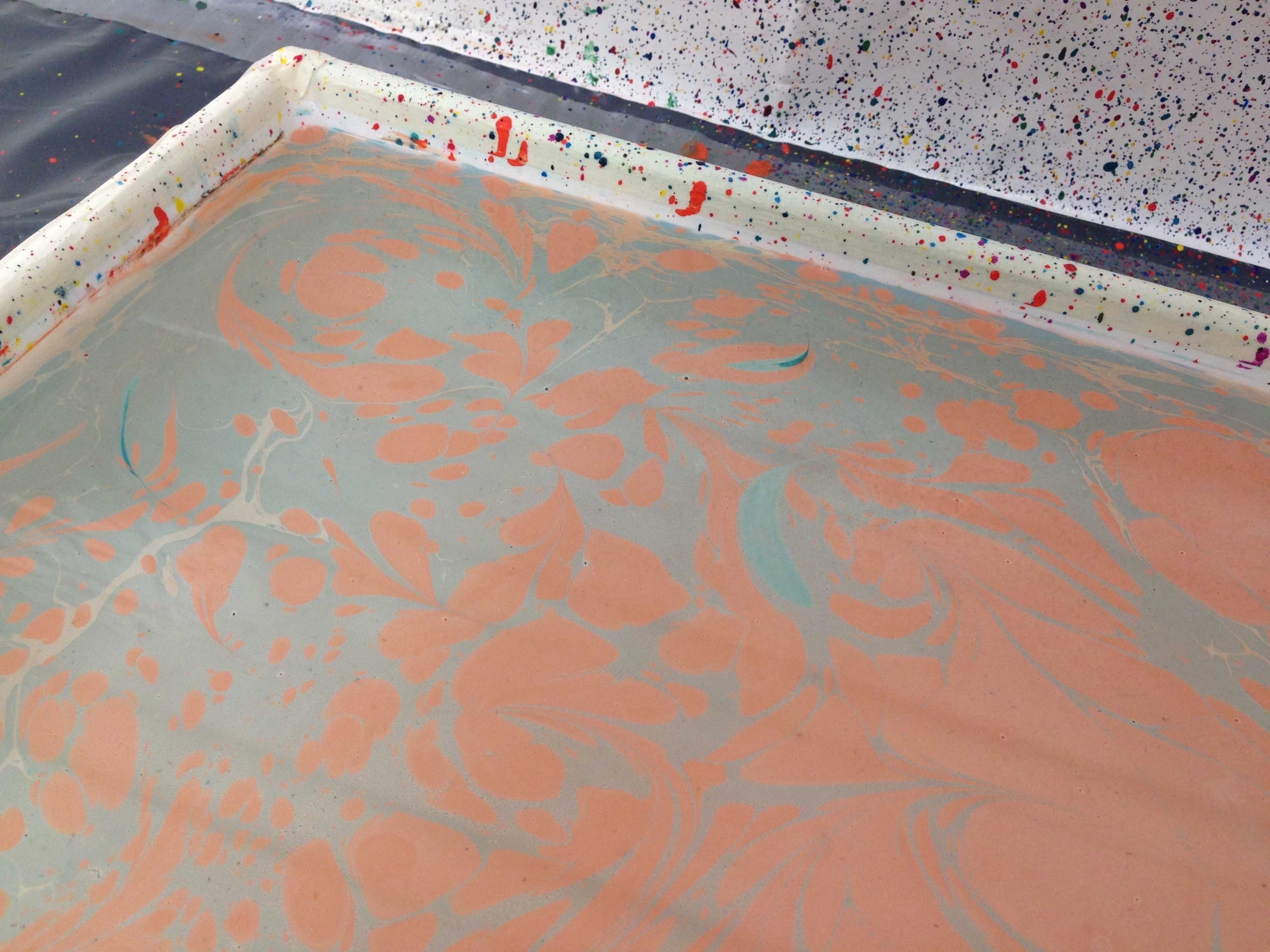
Episode V: Delight’s Copy
Paper marbling and paste paper workshop with Katja Winkes at Leksands folkhögskola, July 2017
The 100 copies of the 1937 publication “Bookmaking on the Distaff Side” are each covered with unique paste papers made by New Jersey-based paste paper artist Delight Rushmore (1912–2017). In fact, our copy was originally her own – on the inside of the cover we can read “no 37, Delights copy”. We wanted to pay tribute to her by making our own paste papers, which we eventually scanned and used as chapter dividers in the Natural Enemies-book.
In order to learn the crafts of creating decorative papers, we enrolled at a summer course at Leksands folkhögskola in the province of Dalacarlia, a residential college for adult education that offers specialized programmes in book binding techniques and related crafts. The course was led by Mora-based bookbinder Katja Winkes and offered the two techniques of making paste paper and paper marbling.


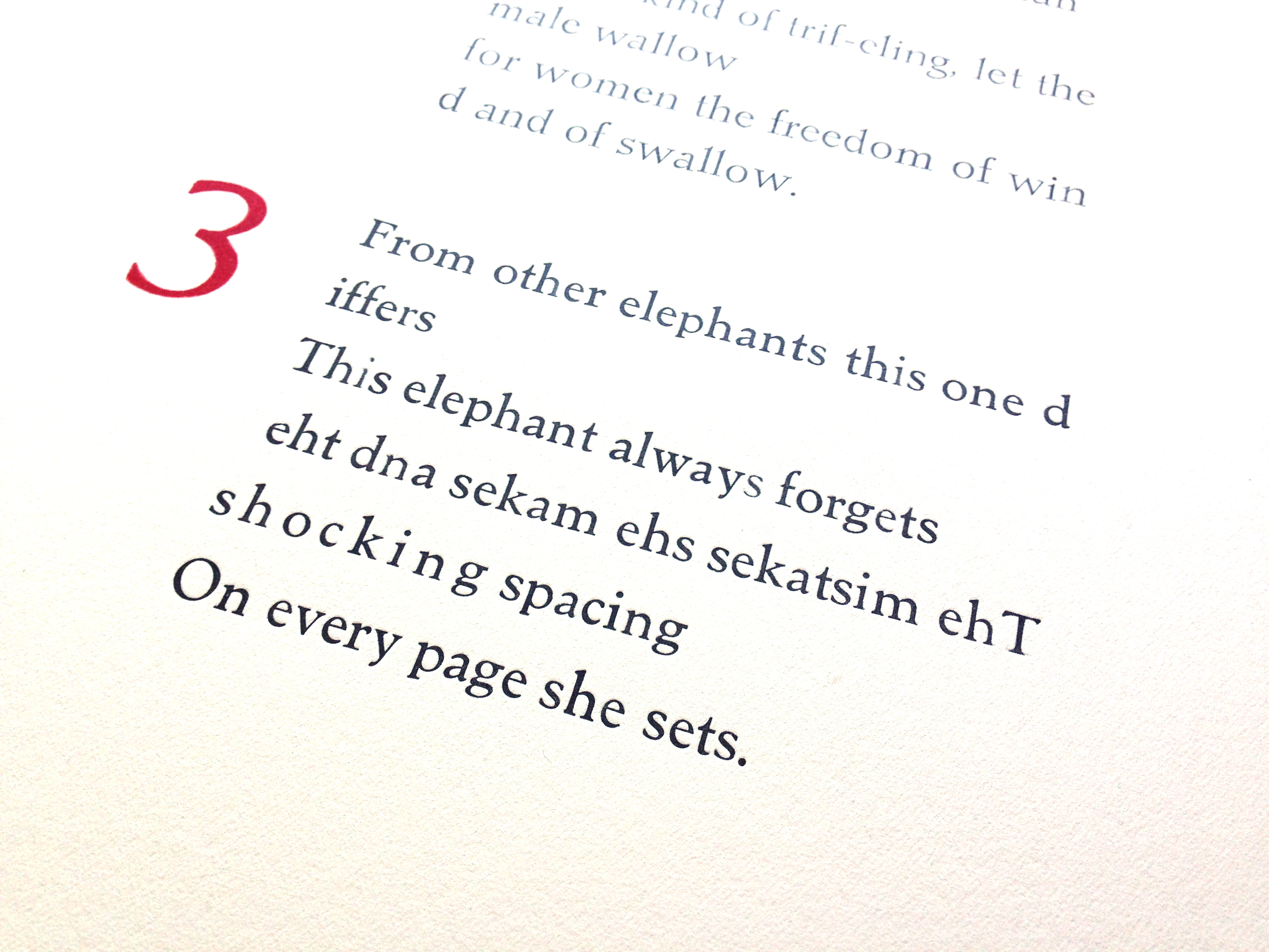
Episode VI: From other elephants this one differs
Paper lithography with Emmy Dijkstra at KKV
March 2017
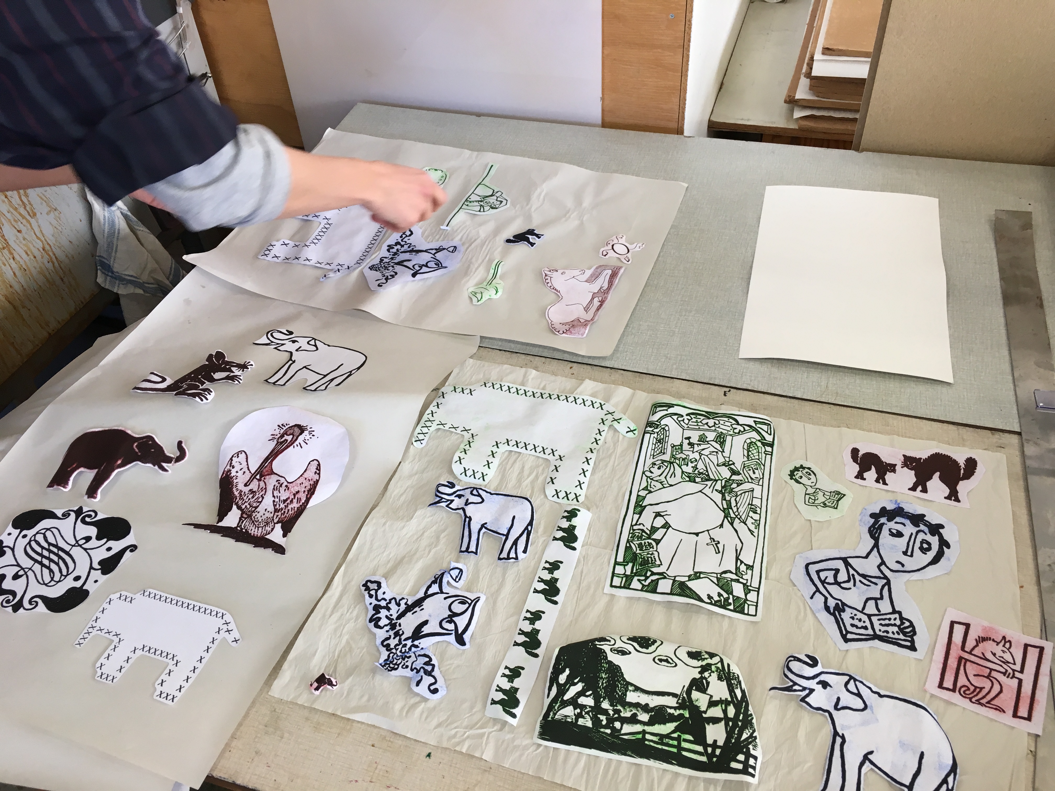
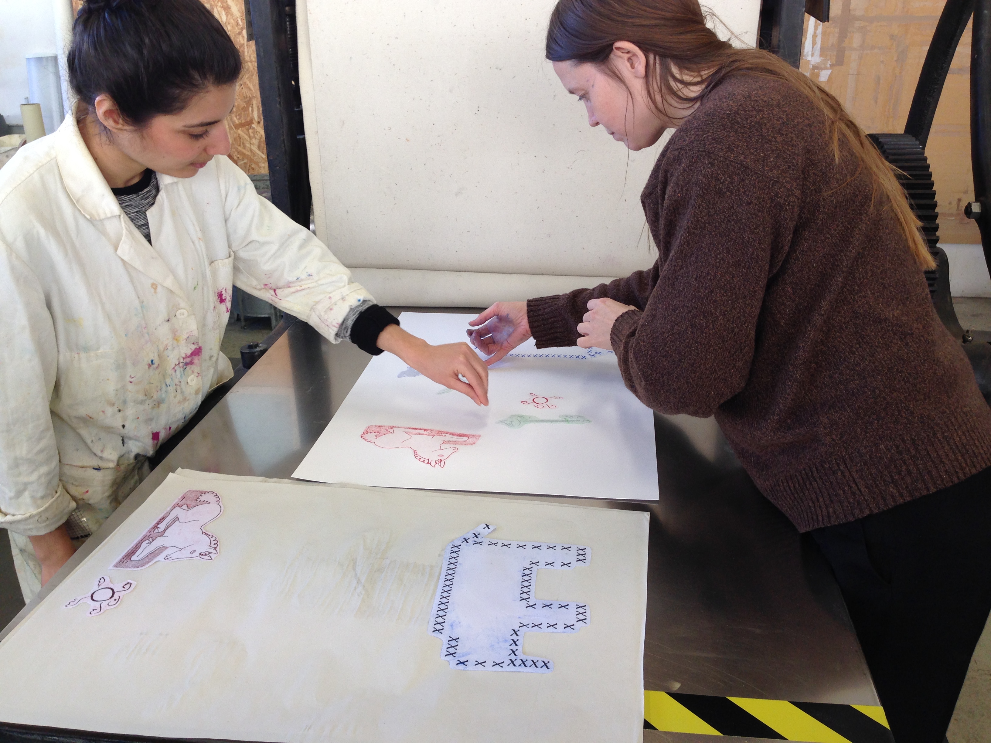
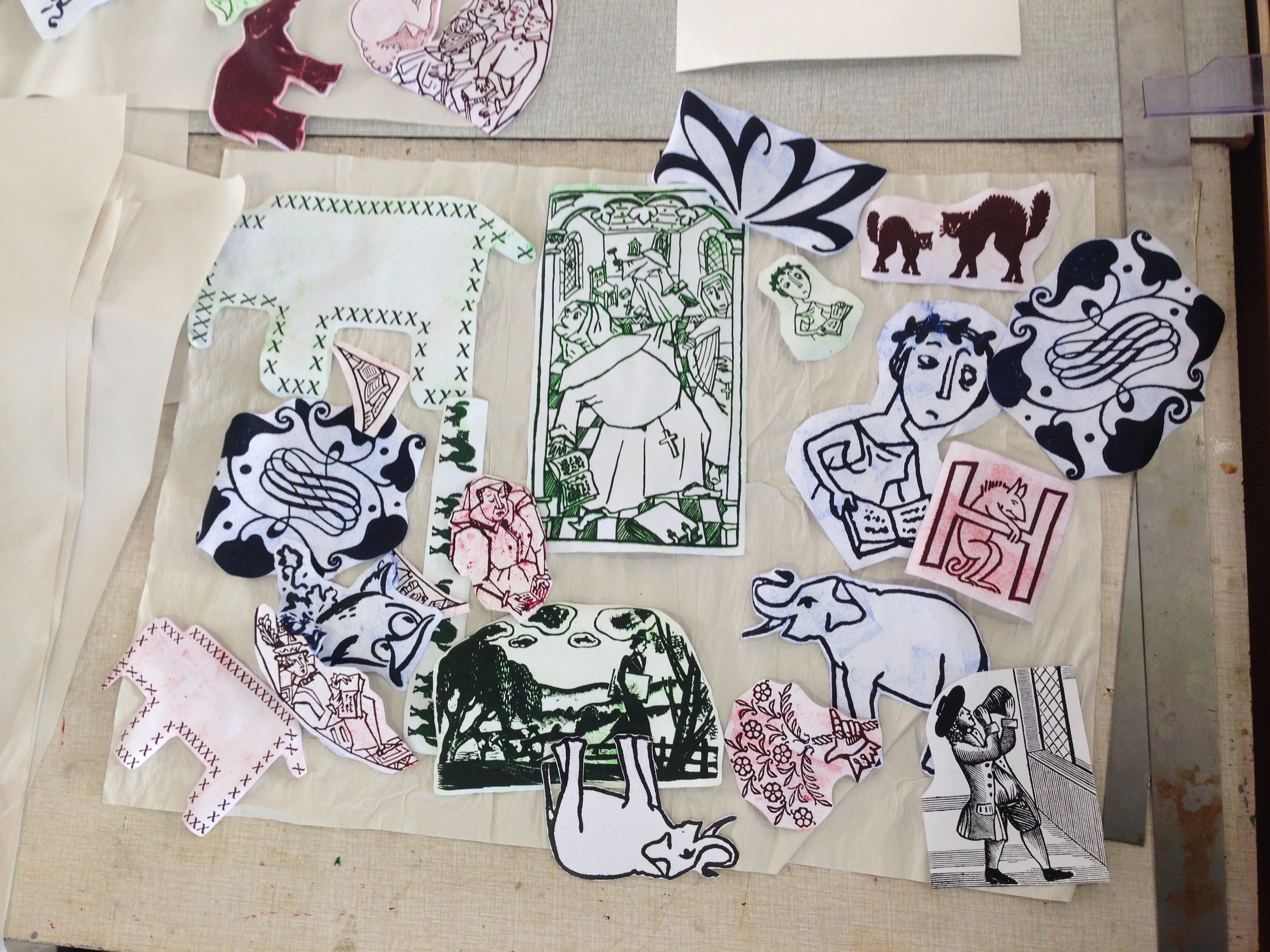
“Bookmaking on the Distaff Side” is a book full of interesting ornaments – hands, mouses, elephants and more, telling stories in the page margins and sometimes as centered elements. Already on the title page you find a typographic ornament: a manicule playfully combined with flowers, so that it forms a hand offering a bouquet. It is a dedication “to the ladies” from the colleague, reputable typographer Bruce Rogers.
Jane Grabhorns contribution to the book has an elephant ornament printed on the title page, it refers to her printing press “the Dumbo” a former children'surg literature press that she used for her own experimental printing. She writes “From other elephants this one differs, she always forgets the shocking spaces and mistakes she makes”
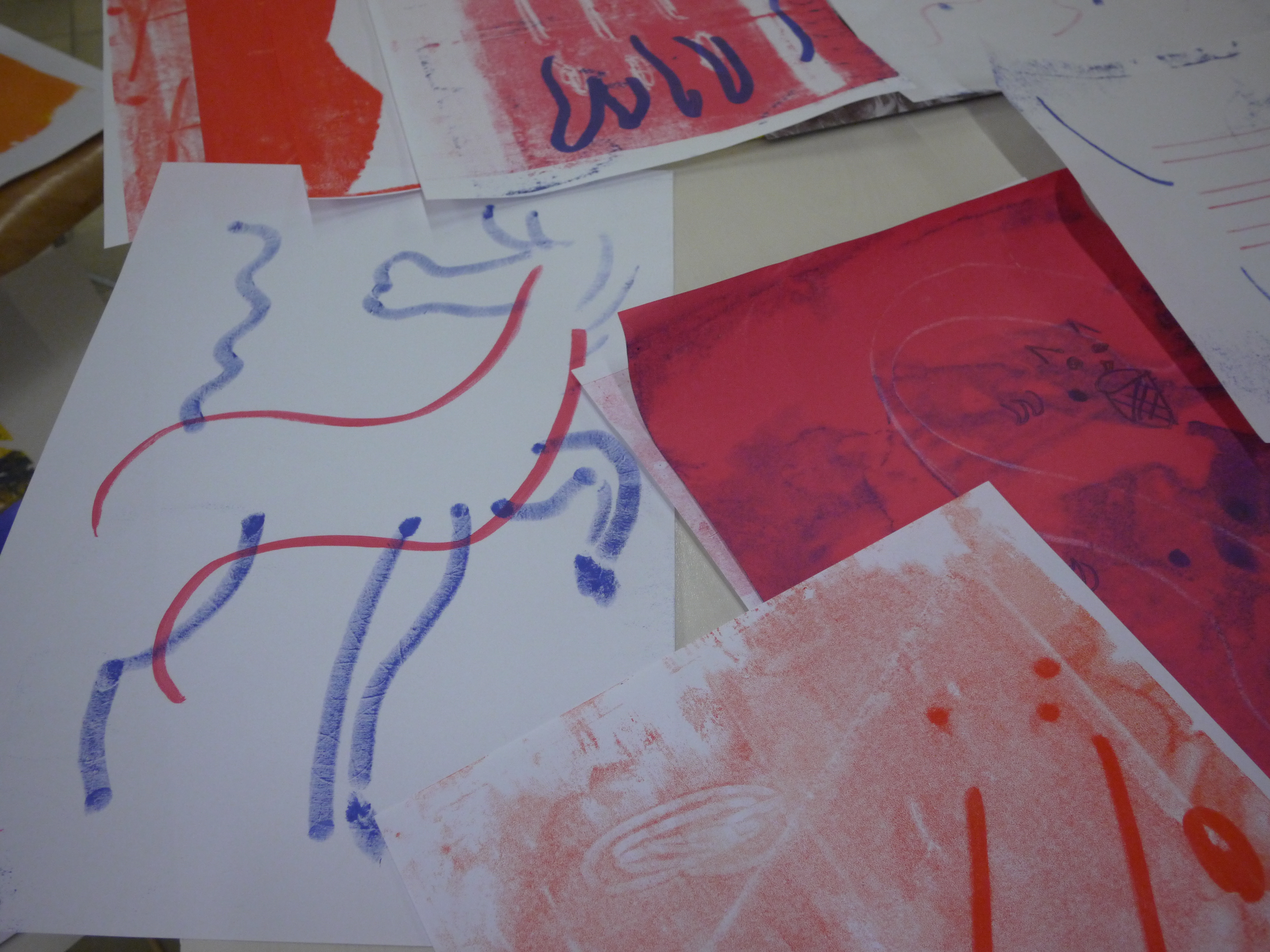
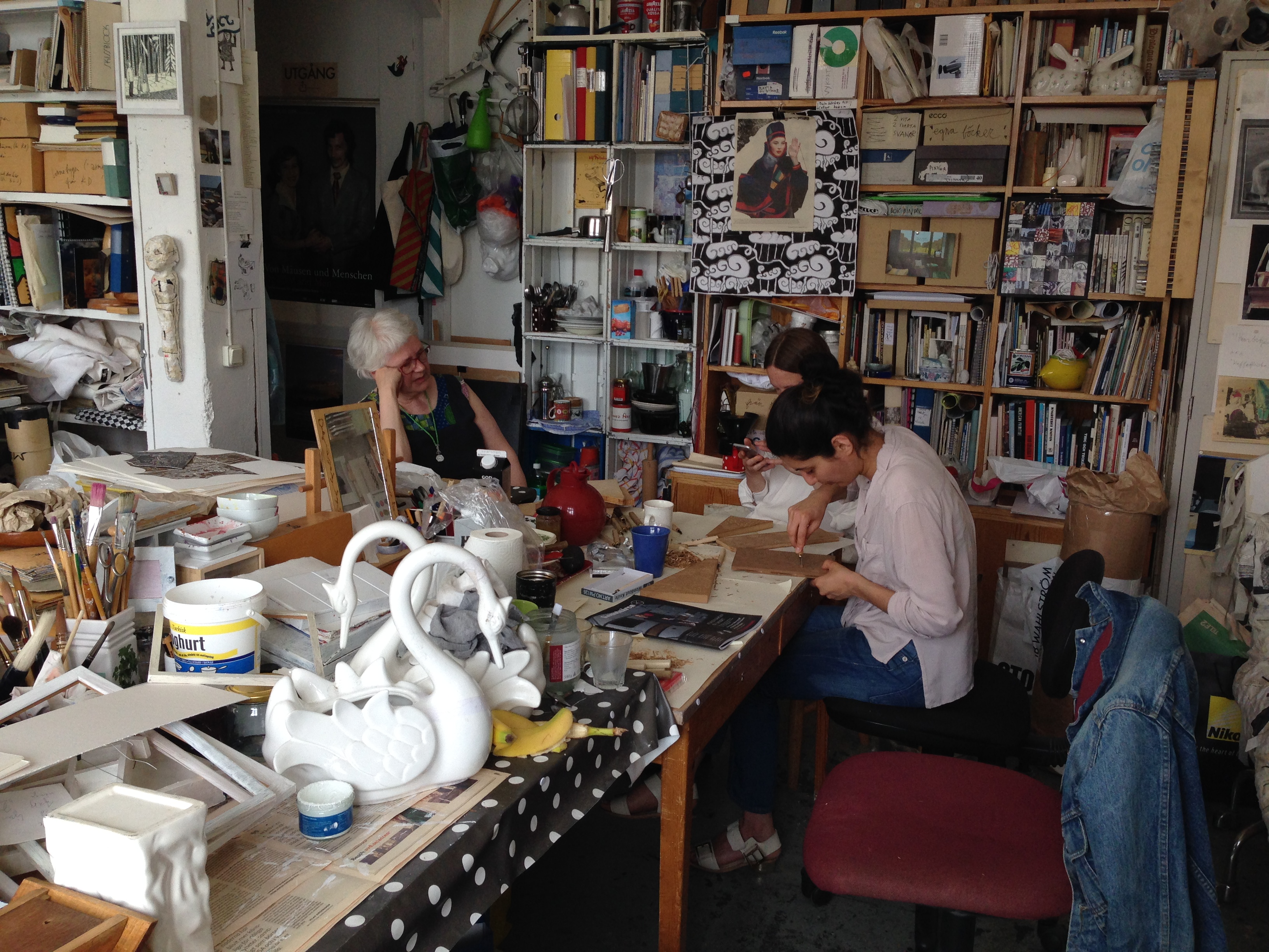
We wanted to collect and highlight the use of ornaments in the book somehow, and found the perfect technique for it when we heard about “paper-lithography”. Paper-lito, also known as “poor man’s lithography” would allow us to take photocopies of the ornaments and then enlarge them as we wish and reproduce them, in color and in new combinations, in this printmaking technique. Stockholm-based printmaking artist Emmy Dijkstra offered courses in this technique at KKV (artists’ collective workshop) in Stockholm and we enrolled. Emmy had learned about this technique during a residency at Manhattan Graphics Center in New York in 2012. To explain in brief; an ordinary photocopy from a xerox machine functions as a quick, easy and lightweight replacement for the lithography stone. With the help of some gum arabicum, water, and a soft roller, the oily xerox ink allows itself for mono print reproductions.